

The two-way table that shows what your plan can survive
Somebody in the room always asks it. You present the plan, the number looks solid, and then: “what if growth comes in lower?” If your answer starts with “let me get back to you,” the meeting is already over.
I built a small sensitivity analysis mini-lesson around one question I get all the time: how do you show leadership what the plan can survive, on one page, before they ask? The answer is a two-way sensitivity table. Here’s the exact one from the lesson.
What you’re looking at
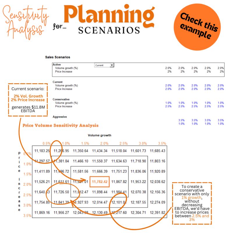
The model behind this table runs a simple sales plan. The current scenario assumes 2% volume growth and a 2% price increase, and that combination generates about $11.8M of EBITDA. That’s the boxed number in the middle of the grid: 11,782.
Everything around it answers the “what if” questions in advance. Each row is a different price increase, each column a different volume growth rate, and every cell is the EBITDA that combination produces. One table, thirty-five futures.
In Excel this is a two-variable Data Table. You build the model once, point the table at the two assumptions you want to stress, and Excel fills the grid. It recalculates whenever the model changes, so it never goes stale the way pasted scenarios do.
How I actually read it in a planning meeting
Start at the center and walk outward. The center is your plan. The neighbors are your ordinary risks. The corners are your bad quarter and your great one.
And then do the walk that makes this table genuinely useful: trade one assumption against the other. Say sales tells you 2% volume growth is optimistic and 1% is more realistic. Slide left one column and EBITDA drops. So the question becomes: what price increase gets us back? Follow the column up and there’s your answer. In this model, holding EBITDA at a 1% growth assumption takes a price increase between 2.5% and 3%.
That’s a negotiation, resolved by a lookup. No new model, no overnight turnaround. The conservative scenario stops being a debate about feelings and becomes a specific commercial decision: can we push price half a point harder, yes or no?
Why the two-way table beats a pile of scenarios
Most planning decks show three cases. Base, upside, downside. Three points, hand-picked, usually built to make the base case look reasonable.
The grid shows the whole neighborhood instead. It reveals things three scenarios can’t: how fast the numbers deteriorate as you move away from plan, whether the model is more sensitive to price or to volume (compare how quickly cells change across a row versus down a column), and where the cliff edge sits, the combination where the plan stops working.
In this example, price moves the outcome faster than volume does. That single observation should change where the team spends its energy this year. That’s the kind of insight leadership actually remembers.
Three habits that keep it honest
Use ranges you can defend. The steps in your grid should come from history or from the people who own the number, not from what makes the chart look calm. If volume swung 3 points last year, a grid that only tests 1 point is decoration.
Anchor the center. The middle cell must tie exactly to the plan you’re presenting. The first thing a sharp CFO does is check that number against the budget. Make it match to the decimal.
Bring it before they ask. The whole value of a sensitivity table is that it answers the “what if” question while your credibility is still intact. As a slide shown proactively it builds trust. As homework after the meeting it repairs it.
Build this table yourself
If you’d rather watch the build than read about it, I recorded the whole thing from a blank sheet: the gross profit model, the volume and cost ranges, the two-variable Data Table setup, and the conditional formatting that turns the grid into a heat map.
One trick from the video worth stealing: point the color scale at your current position, so anything better than today shades green and anything worse shades red, and mark the current cell with a dashed border so nobody has to hunt for it. Small touches, but they’re the difference between a table people read and a table people ask you to explain.
The download is the model behind the mini-lesson: the sales scenario setup (current, conservative, aggressive), the live two-variable Data Table, and the EBITDA build that feeds it. Open it, change the assumptions, and watch the grid rewrite itself. Once you’ve built one of these, you won’t present a plan without it.
Get the sensitivity model from the mini-lesson
The exact file behind the table above: the scenario setup, the live two-variable Data Table, and the EBITDA build. Change the assumptions and watch it rewrite itself.